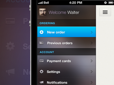
Slide-out navigation UI for iOS

Iphone-slide-preview

1 Attachment

22 Responses

  1. Aurélien Foutoyet Aurélien Foutoyet

    "Slide-out" navigation UI for an iOS app
    Hi-res preview here

    likes

    8 months ago

  2. Olivier Massain Olivier Massain

    Awesome!

    8 months ago

  3. Aurélien Foutoyet Aurélien Foutoyet

    thx !

    8 months ago

  4. Ted Goas Ted Goas

    Where is the blurry image in the menu's background coming from? Will it be persistent or change with the screen content?

    8 months ago

  5. Aurélien Foutoyet Aurélien Foutoyet

    @Ted Goas The bg will be persistant and it comes from multiple marketing sources (print / print screen from product vids etc., all connected to the app of course) + Photoshop effects (noize + gaussian blur)

    likes

    8 months ago

  6. Loris Grillet Loris Grillet

    Sleek, love the transparent/blurred menu background!

    8 months ago

  7. Aurélien Foutoyet Aurélien Foutoyet

    Thanks @Loris Grillet !

    8 months ago

  8. Tomas Gajar Tomas Gajar

    @Aurélien Foutoyet Looks great - especially color scheme!

    8 months ago

  9. zee7 ✽ zee7 ✽

    not a fan of blurred background behind the nav. Other than that it looks great! What icon pack are you using there?

    8 months ago

  10. Aurélien Foutoyet Aurélien Foutoyet

    @Tomas Gajar thx ;)
    @zee7 ✽ Thx for your feedback. I'm using Helveticons + some custom one.

    8 months ago

  11. Pascal Gärtner Pascal Gärtner

    It looks really good to me and I have to say that the blurred background behind the navigation is quite refreshing as well as the color scheme.

    8 months ago

  12. Sean McCabe Sean McCabe

    Good stuff! Lots of subtle detail. "New order", "Previous orders", and "ACCOUNT" look like they could use some vertical centering, but I'm sure that will all be handled in code. =)

    8 months ago

  13. Tiago Gerken Tiago Gerken

    Amazing, dude! But considering that the light comes from up, i'd change the directions of the shadows. What you think?

    8 months ago

  14. Alexander Scott Alexander Scott

    Ugh.

    8 months ago

  15. Nuruzzaman Sheikh Nuruzzaman Sheikh

    simple and nice!

    8 months ago

  16. George Gliddon George Gliddon

    Cool concept, but I think it's a little intense. Not a fan but good idea!

    8 months ago

  17. Aurélien Foutoyet Aurélien Foutoyet

    Thanks for your multiple feedbacks guys I appreciate.
    @Sean McCabe you're absolutely right, my fault... I have to realign my items.
    @George Gliddon Yeah I wanted to try something but I guess it could definitely be improved... maybe decreasing the contrast a little bit. Thx for your feedback !

    8 months ago

  18. Tommy Roussel Tommy Roussel

    Ça tue Aurélien ;) Bien joué !

    8 months ago

  19. Charlie via Issland. Charlie via Issland.

    Every spacing is wrong, how did you do that? some skill? :)

    8 months ago

  20. Aurélien Foutoyet Aurélien Foutoyet

    @Tommy Roussel Thx dude ;)
    @Charlie / TheIssland Thx for your feedback. Yeah you're right and as I said to @Sean McCabe it's far from being perfect but that's not a finished product, just a WIP as @dribbble tagline suggests.

    8 months ago

  21. Charlie via Issland. Charlie via Issland.

    @Aurélien Foutoyet No, I don't want to offend you or something, but it looks little funny for me, when I look on it, if there is just one wrong, but in every :) that needs skill :)

    8 months ago

  22. Aurélien Foutoyet Aurélien Foutoyet

    @Charlie / TheIssland sure ! no offense :)

    likes

    8 months ago

keyboard shortcuts: previous shot next shot L or F like