Google+

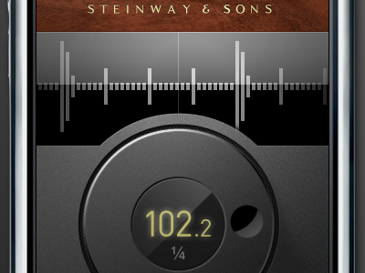
Steinway Metronome App

20 Responses

  1. Pro Google+ Jesse Bennett-Chamberlain

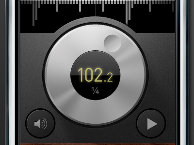
    Potential jog dial rework...

    about 2 years ago

  2. Pro Tintype-tim-square Tim Van Damme

    I hate you so much.

    about 2 years ago

  3. Pixelavatar_large_16_color Chris Wallace!

    Agree with Tim. But in a good way.

    about 2 years ago

  4. Pro Anthonydines Anthony Dines

    Loving this revision, my only issue with it is that every thing except the "finger divit" feels correct. It seems too perfectly cut, where as everything else has a nice beveled edge to it, as well as texture/softness. I think if you make the shadow feel more realistic/soft?, and maybe add the nice stroke from the other elements that add the beveled edge... it would RULE!!!!

    about 2 years ago

  5. Pro Phil_newavatar2 Phil Coffman

    I'm taking notes here. Excellent rework Jesse!

    about 2 years ago

  6. Pro Mtn_rogie Rogie

    Great way to not look like Beats app. Very nice rework Jesse!

    about 2 years ago

  7. Pro Google+ Jesse Bennett-Chamberlain

    Thanks everyone...

    about 2 years ago

  8. Pro Pic Benjamin De Cock

    So sexy...

    about 2 years ago

  9. Pro Mefacesface Alan Houser

    GOOD GOD MAN.

    about 2 years ago

  10. Eddit_2 Eddie Wilson

    Very much digging the lighting direction. Just dramatic.

    Feel like I'm at some rich guys house and I'm dying to touch his fancy stereo components.

    about 2 years ago

  11. Pro 500px Chad Engle

    Reminds me of a Steinway 12ft concert grand now thats gloss black and glistening in the stage lights. Instead of a cool interface thing from before. Nice job on the rebound. Game. Set. Match.

    about 2 years ago

  12. Pro Whitespace-a Kyle Meyer

    Gorgeous, wish the gold typeface near the top was just a taaaaad thicker, but other than that...

    about 2 years ago

  13. Prandall-logo-v2 Paul Randall

    I really like this version with the black dial, and the design looks absolutely amazing!

    about 2 years ago

  14. Pro Gedy Gedy Rivera

    Holy Canole! @_@ That looks amazing. Beautiful work.

    about 2 years ago

  15. Pro Hartless Brian Hart

    Beautiful work. Now to build one for us guitar players...
    Gibson Les Paul please...

    about 2 years ago

  16. Avatar Didier Forest

    Hey, on this one, the border is so better. So forget what I said, go with that !

    about 2 years ago

  17. Josh Josh Brewer

    Seriously elegant and such amazing attention to detail. I agree with Kyle Meyer re: gold typeface FWIW.

    about 2 years ago

  18. Google+

    about 2 years ago

  19. Pro Cyan Robert Padbury

    Absolutely Gorgeous

    almost 2 years ago

  20. Pro Tosh-logo-avatar-300x300 Thomas Schranz

    Slick!

    9 months ago

keyboard shortcuts: previous shot next shot L or F like