Find designers
Designer search
Quickly find your next designer
Post a job
The #1 job board for design talent
Inspiration
Courses
UX Diploma
Learn UX design from scratch in 6 months
UI Certificate
12-week UI skill building for designers
Live interactive workshops
with design professionals
Jobs
Go Pro
Log in
Dribbble: the community for graphic design
Log in
Sign up
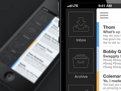
iPhone Mail App v3
Ari Sawyers
Follow
Following
Like
#222223
#EFF2F4
#3D3F40
#A0A1A3
#B8CADE
Download color palette
I was bored yesterday, so this happened.
Full Pixels
EDIT: THIS IS GOING TO BE A REAL APP!
color
flat design
iphone
iphone 5
iphone app
mail
mail app
minimal
simple
View all tags
Posted on Oct 22, 2012
6,563
43
165
17
View feedback
Ari Sawyers
More by Ari Sawyers
View profile
Previous
Next
Loading…