Find designers
Designer search
Quickly find your next designer
Post a job
The #1 job board for design talent
Inspiration
Courses
UX Diploma
Learn UX design from scratch in 6 months
UI Certificate
12-week UI skill building for designers
Live interactive workshops
with design professionals
Jobs
Go Pro
Log in
Dribbble: the community for graphic design
Advance your career with a Professional Diploma in UX Design
Learn more
Log in
Sign up
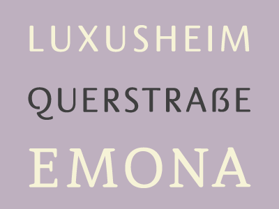
Emona Typeface
Julian Hrankov
Follow
Following
Like
#BEB0BF
#F0ECD5
#3F3F3F
#867E87
#676367
Download color palette
Custom typeface for
Emona House
.
art machine
beautiful
beige
bulgaria
custom
emona
font
germany
julian hrankov
luxury
purple
rounded
typeface
View all tags
Posted on Oct 22, 2012
1,923
1
49
10
View feedback
Julian Hrankov
Senior Brand Designer at MetaDesign Berlin.
More by Julian Hrankov
View profile
Previous
Next
Loading…