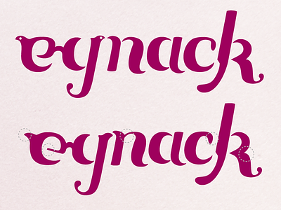
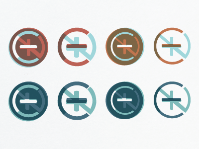
Eynack Site Logo (progress)
The original idea was a little too modern and sterile, so we opted instead to go for a friendlier, more elegant route. The glasses are visible on the "ey" and the stem of the "k" is one of their uniquely shaped ear frames, both important caveats to the client.
The top is the most current, while the bottom is an earlier version with a few redeeming qualities (noted by the dashed circles). I am looking for some good crits, so fire away!
View all tags
Posted on
Oct 18, 2012
More by Danielle Evans View profile
Like


