Find designers
Designer search
Quickly find your next designer
Post a job
The #1 job board for design talent
Inspiration
Courses
UX Diploma
Learn UX design from scratch in 6 months
UI Certificate
12-week UI skill building for designers
Live interactive workshops
with design professionals
Jobs
Go Pro
Log in
Dribbble: the community for graphic design
Log in
Sign up
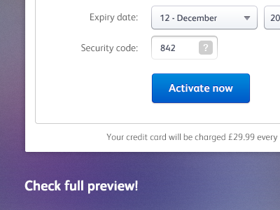
Activation wizard concept
Michal Vasko
Available for work
Follow
Following
Like
Get in touch
#FDFDFD
#635A8D
#5F5376
#9EA0AC
#1784CF
#103DB1
Download color palette
Check out full preview!
activate
cards
concept
online
payment
paypal
visa
wizard
View all tags
Posted on Oct 18, 2012
6,408
12
84
5
View feedback
Michal Vasko
Get in touch
More by Michal Vasko
View profile
Previous
Next
Loading…
Loading…
Loading…