StrategyBlocks connect

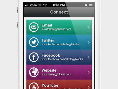

Working on the connect/social networking page of the app.
Larger view: View
Icons: The Noun Project
iPhone: iPhone 4s Template
Additional screens: view
Working on the connect/social networking page of the app.
Larger view: View
Icons: The Noun Project
iPhone: iPhone 4s Template
Additional screens: view


