Find designers
Designer search
Quickly find your next designer
Post a job
The #1 job board for design talent
Inspiration
Courses
UX Diploma
Learn UX design from scratch in 6 months
UI Certificate
12-week UI skill building for designers
Live interactive workshops
with design professionals
Jobs
Go Pro
Log in
Dribbble: the community for graphic design
Advance your career with a Professional Diploma in UX Design
Learn more
Log in
Sign up
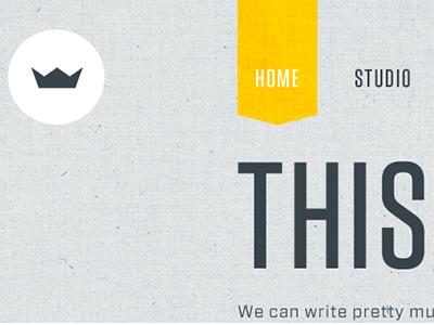
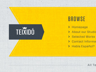
Header
Juan M. Teixidó
Follow
Following
Like
#E1E4E5
#FFCC01
#39444A
#A8AEAE
#788085
Download color palette
Almost done. Hopefully, this Friday.
Rebound of
Footer
By
Juan M. Teixidó
design
header
texture
web
View all tags
Posted on Nov 10, 2010
13,630
30
272
37
View feedback
Juan M. Teixidó
More by Juan M. Teixidó
View profile
Previous
Next
Loading…