Hmm, I very much like the styling, however the alignment of the glyphs on the buttons on the bottom seems odd. I'd move the gamera glyph many pixels down, and the photos glyph several pixels left, gear several pixels right. Other than that, superb.
Also, on the buttons at the top, though they are pretty, they do blend into the background, to the point that maybe just the glyphs themselves would be sufficient. Either that or gloss on the base would help to distinguish them from the photo.
rather its colour. because its a fairly bright colour, there is contrast between the image on screen and the buttons, which could distract from what the whole point of the app is, to take great photos. just my thoughts
16 Responses
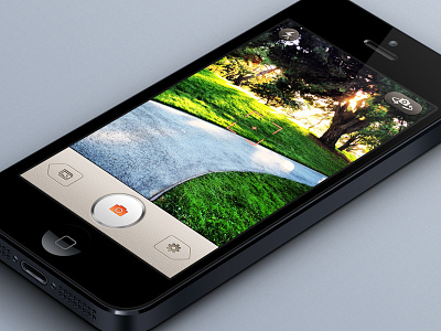
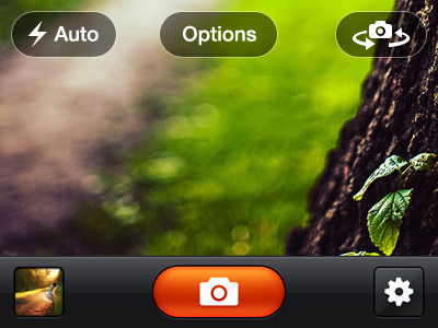
Been working on this app for a while now, just adding up finishing touches. Check out the attachment for full shot.
8 months ago
looks awesome Umar. Love the on-screen buttons
8 months ago
This circle button looks very great. Have you tried the blue color about the camera icon, it could be nice too.
8 months ago
That metal button looks little weird, because there is no reflection on that top of it :) but rest looks nice!
8 months ago
rad!
8 months ago
Looks good! only thing for me confusing about tab bar buttons looks like previous and next.
8 months ago
You come up with some really badass ideas! W.R.T. this shot, the bottom toolbar with the settings and gallery buttons.
I'm wondering if this will fare well on a 960px screen.
Imp. point: Don't you think the gallery pictogram should have a thicker frame to resonate with the settings or the flash pictograms?
8 months ago
Hmm, I very much like the styling, however the alignment of the glyphs on the buttons on the bottom seems odd. I'd move the gamera glyph many pixels down, and the photos glyph several pixels left, gear several pixels right. Other than that, superb.
Also, on the buttons at the top, though they are pretty, they do blend into the background, to the point that maybe just the glyphs themselves would be sufficient. Either that or gloss on the base would help to distinguish them from the photo.
8 months ago
@Eli Schiff Kool, thanks :) I will be experimenting something different for the top buttons as well.
@Nikh Well for 960px screen there is a whole seperate design. And I guess you are right about the image icon. Will work on it :)
@Raghavendra Shet Well, that was the whole point of it, that's how the client wanted it to look like.
@Charlie / TheIssland Will see what I can do about it, but this is how the client wanted.
@Alexandre Naud Well, I did, but orange goes better with the whole UI.
Thanks all :)
8 months ago
Hmmm. I thought its a client requirement! :)
8 months ago
Slick
8 months ago
Nice work!
8 months ago
for most part its really nice, but I feel the bottom row, with the capture button and other navigations is too distracting from the image.
8 months ago
@Toby Seers I am not sure what you mean by that exactly, are you talking about the size of the bottom bar?
8 months ago
rather its colour. because its a fairly bright colour, there is contrast between the image on screen and the buttons, which could distract from what the whole point of the app is, to take great photos. just my thoughts
8 months ago
Impressive stuff!
8 months ago