


Color Comfort Zone

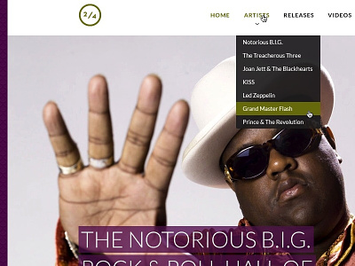
I have been challenged to use colors that are far outside of my comfort zone (which tend to be muted and desaturated). So I spent the entire day developing a working color palette. The base color is purple and the accent is green. The main menu system and drop down background is a dark gray mixed with the purple.
This is as far as I have gotten and I think it is time to step away from it. When I come back to this in the morning, I hope I feel as good about it as I do now. Knowing me, probably not.


