@Kyle Meyer It's only if I tilt my MBA a touch that I see a different coloured square around the icon than that of the main background. I also see dead people so this could be coincidence.
Gavin is right, even though it's hardly noticeable there seems to be a tiny difference in color value. The square where the icon is in seems to be #e31f39 while the rest is #e61934
@Kyle Meyer : Just checked and you can't see the difference in color on an iMac screen (I'm assuming you can't see it on a Cinema display either), but you can definitely see it on a MacBook Air.
28 Responses (page 1 of 2)
Pro
Kyle Meyer
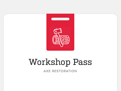
A little skeu goes a long way.
7 months ago
Pro
Patrick Algrim
Perfect.
7 months ago
Yes, this looks good.
7 months ago
Pro
Brandon Oxendine
Yep.
7 months ago
Needs more texture and gradients and shadows and
7 months ago
You really skeud this one up.
7 months ago
Pro
Chris Johnson
Love it
7 months ago
You think you're so skeute.
7 months ago
Skeuse me?
7 months ago
It's skeutiful.
7 months ago
I'll always love your clean, crisp style Kyle. This shot is very inspirational as an elegant piece.
7 months ago
Pro
Bill S Kenney
um yeeeaaaaahhhhhhhhh
7 months ago
Pro
Anthony Lane
I don't know, doesn't look enough like a real badge.
7 months ago
Pro
Ben Johnson
Love this, great work!
7 months ago
whats the font on workshop pass?
7 months ago
Pro
Gavin Elliott
Am I right in thinking the background to the axe/wood icon is a different color to the red which it sits on?
Looking forward to Build.
7 months ago
Pro
Kyle Meyer
@Gavin Elliott — zoomed in using Photoshop. Not seeing that at all?
7 months ago
Pro
Gavin Elliott
@Kyle Meyer It's only if I tilt my MBA a touch that I see a different coloured square around the icon than that of the main background. I also see dead people so this could be coincidence.
7 months ago
Pro
Asif Aleem
i like it
7 months ago
Pro
Jeremey Fleischer
This is the nicest badge for a men's fragrance and deodorant line, that I've ever seen.
7 months ago
Pro
Marvin Kennis
Beautiful work!
Gavin is right, even though it's hardly noticeable there seems to be a tiny difference in color value. The square where the icon is in seems to be #e31f39 while the rest is #e61934
7 months ago
Pro
Haziq Mir
The difference between the color shades is there, but it's barely visible. Love it.
7 months ago
@Jared West & @CJ Melegrito : The title is not Adelle, it's Kulturista Web and the other is Proxima Nova.
@Kyle Meyer : Just checked and you can't see the difference in color on an iMac screen (I'm assuming you can't see it on a Cinema display either), but you can definitely see it on a MacBook Air.
7 months ago
Pro
CJ Melegrito
@Kevin Clark deleted my comment in pure shame! D:
Thanks for the font correction! :P
7 months ago
Pro
Kyle Meyer
@Kevin Clark — Interesting, will find an Air to take a look, thanks!
7 months ago