Millie's Sketch

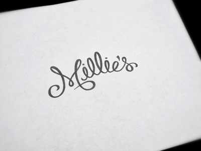
word mark for a gift and collectables retail establishment based in phoenix, arizona. the idea behind the script was to emulate gift wrap ribbon. i used several different brush pens to get the 'look' i was going for.
word mark for a gift and collectables retail establishment based in phoenix, arizona. the idea behind the script was to emulate gift wrap ribbon. i used several different brush pens to get the 'look' i was going for.


