Barcode Icon

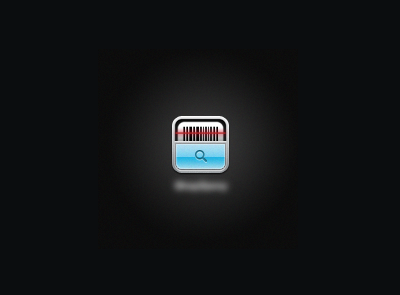
Still trying to achieve that "perfect sexy" look for this Icon. I cannot for the life of me find a good looking way to display a barcode in an Icon. Anyone have any other thoughts or suggestions?
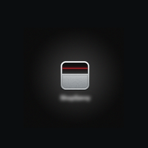
Still trying to achieve that "perfect sexy" look for this Icon. I cannot for the life of me find a good looking way to display a barcode in an Icon. Anyone have any other thoughts or suggestions?


