Find designers
Designer search
Quickly find your next designer
Post a job
The #1 job board for design talent
Inspiration
Courses
UX Diploma
Learn UX design from scratch in 6 months
UI Certificate
12-week UI skill building for designers
Live interactive workshops
with design professionals
Jobs
Go Pro
Log in
Dribbble: the community for graphic design
Advance your career with a Professional Diploma in UX Design
Learn more
Log in
Sign up
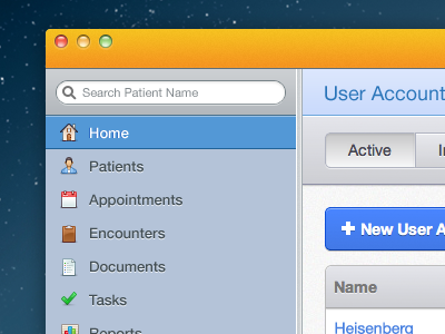
Desktop Application Interface
Lee Munroe
Follow
Following
Like
#B3C1D4
#E4E6EC
#F5A920
#0E344D
#518AD1
#1F4760
Download color palette
app
application
desktop
healthcare
interface
medical
nav
navigation
search
tabs
ui
View all tags
Posted on Oct 1, 2012
3,731
2
19
5
View feedback
Lee Munroe
Welcome to my design portfolio on Dribbble
More by Lee Munroe
View profile
Previous
Next
Loading…