Pittsburgh, PA

Hiiii

6 Responses

  1. Pro Theresa Garritano Theresa Garritano

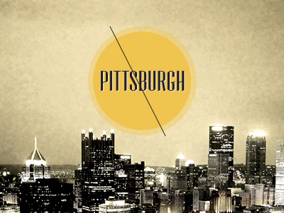
    A little logo I created for the Pittsburgh, PA website i'm currently working on in my GUI class.

    8 months ago

  2. Pro Jon Lavalley Jon Lavalley

    the line through the middle is a little distracting. Other than that, it looks pretty cool.

    likes

    8 months ago

  3. Pro Theresa Garritano Theresa Garritano

    @Kelsey probably because i used that thing from javas as inspiration. The little cardboard ad that was on my mirror all year at triton

    8 months ago

  4. Pro Theresa Garritano Theresa Garritano

    I think it said retro grade er something on it

    8 months ago

  5. Pro Matt Olpinski Matt Olpinski

    I actually like the concept of the line but I want it lighter or less noticable because it does compete with the black type a bit. or maybe cut out the line where the text is + 5 pixels or something

    likes

    8 months ago

  6. Home of the Pittsburgh PA website i'm re-designing for my GUI class right now. Thoughts please :)

    8 months ago

keyboard shortcuts: previous shot next shot L or F like