Sports app

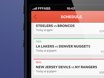
A little preview for an app I started designing a while ago while helping the cool guys over at http://otherscreen.com - (@otherscreen). Developed by the awesome @lukeredpath More screens to come soon :)
A little preview for an app I started designing a while ago while helping the cool guys over at http://otherscreen.com - (@otherscreen). Developed by the awesome @lukeredpath More screens to come soon :)


