Analytics

25 Responses

  1. Pro Jip Jip

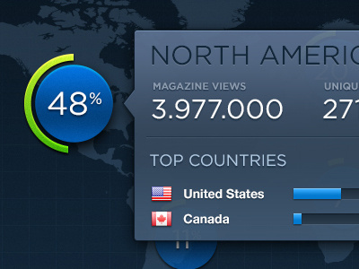
    Active state for continent stats. Check out attachments for more pixels(& active states) on an iPad. Maybe I'll upload some more shots soon.

    Enjoy your weekend! Cheers! ✌

    likes

    8 months ago

  2. Pro Rick Waalders Rick Waalders

    Love the graph on the full view!

    Edit: the rest too ofcourse...

    likes

    8 months ago

  3. Pro Rodrigo Grundig Rodrigo Grundig

    Awesome work, bro, as usual ;) So slick.
    I really liked the way you did the top countries progression bar in a way to make an aligned column. A simple detail, yet inspiring.

    likes

    8 months ago

  4. Pro Coleman Tharp Coleman Tharp

    SO GOOD.

    likes

    8 months ago

  5. Pro Jack Bingham Jack Bingham

    Love it all. Really nice work.

    likes

    8 months ago

  6. Pro Jip Jip

    8 months ago

  7. Pro Aqib Mushtaq Aqib Mushtaq

    Awesome!

    likes

    8 months ago

  8. Seb Jachec Seb Jachec

    So smooth. Love all this!

    likes

    8 months ago

  9. Pro Andriy Noble Andriy Noble

    Looks really amazing, I was wondering if you got the world map somewhere specific? Or if you created it yourself? If you found it anyway I could get it?

    likes

    8 months ago

  10. Pro Jip Jip

    8 months ago

  11. Pro Umar Irshad Umar Irshad

    Nice work :)

    likes

    8 months ago

  12. Pro Moises Oswaldo Urrutia Moises Oswaldo Urrutia

    Great job! I do feel like the map area is way too blue. everything has a tint of blue or is a shade of blue and that makes things not pop. The bottom is beautiful because things have nice contrast. I also think that "North America" is way to dark. My eye goes straight there and its hard to look elsewhere without looking at the title constantly.

    I hope that helps!

    likes

    8 months ago

  13. Pro Filip Santa Filip Santa

    pretty amazinG!

    likes

    8 months ago

  14. Pro Tim Lum Tim Lum

    Sweet pixels bro!

    likes

    8 months ago

  15. Pro Kaushik V. Panchal Kaushik V. Panchal

    nice one :) I dig that transparency

    likes

    8 months ago

  16. Pro Alex Parker ⇢ ☁ Alex Parker ⇢ ☁

    i like the gradientization on the blue "coin" behind the 48. Me thinks good werks.

    likes

    8 months ago

  17. Pro Haziq Mir Haziq Mir

    Me is in love! Would do something about those flags' border.

    likes

    8 months ago

  18. Pro Yura Yarokhovich Yura Yarokhovich

    Impressive!

    likes

    8 months ago

  19. Pro Jip Jip

    @Haziq Mir le me also hates those vague flag borders. Have to find another flag icon set indeed ;)

    8 months ago

  20. Pro Ronny Hummitzsch Ronny Hummitzsch

    Like the colors, the figures and the details ... Good job

    likes

    8 months ago

  21. Pro Dhiren Adesara Dhiren Adesara

    A W E S O M E ~ ;)

    likes

    8 months ago

  22. Pro Lukas Majzlan Lukas Majzlan

    so sharp so nice!

    likes

    8 months ago

  23. Pro Ronny Hummitzsch Ronny Hummitzsch

    What font do you use in headlines ?

    likes

    8 months ago

  24. Pro Jip Jip

    @Ronny Hummitzsch Gotham it is

    8 months ago

  25. Pro Ronny Hummitzsch Ronny Hummitzsch

    o my god yea, ... i used it on www.theiconist.de ... but somehow didn't recognized it ... good one, thanx

    likes

    8 months ago

keyboard shortcuts: previous shot next shot L or F like