Find designers
Designer search
Quickly find your next designer
Post a job
The #1 job board for design talent
Inspiration
Courses
UX Diploma
Learn UX design from scratch in 6 months
UI Certificate
12-week UI skill building for designers
Live interactive workshops
with design professionals
Jobs
Go Pro
Log in
Dribbble: the community for graphic design
Advance your career with a Professional Diploma in UX Design
Learn more
Log in
Sign up
Twitter
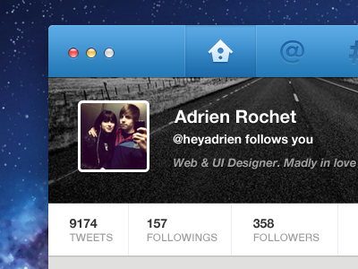
Adrien Rochet
Available for work
Follow
Following
Like
Get in touch
#201E21
#F7F7F7
#192959
#4B96CF
#2D6BAA
#5E5C5D
#A3A19F
Download color palette
app
mac
twitter
ui
View all tags
Posted on Sep 28, 2012
4,802
10
178
8
View feedback
Adrien Rochet
Welcome to my design portfolio on Dribbble
Get in touch
More by Adrien Rochet
View profile
Previous
Next
Loading…
Loading…
Loading…