Friction Factory Indoor Climbing Logo

99% there now. Need to sit on this now for a few days, come back and make those last detail tweaks, checking kerning, proportions etc.
*Since posting this, I have updated the font style, both words now the same weight. Looksie
So what do we have
New squarer font, with a little bit more character. But still has some nice curves to match the person.
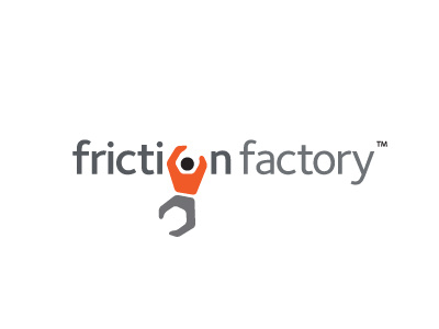
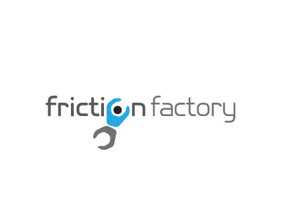
Some colour options
Also made the person less angular/wrench like, so more focus on curves than angles, more so on the inside of the arms. The curves of the font, in most parts, match the curves on the person.
Made a few tweaks to the person to make it looking slightly more dynamic, more like it's free floating in mid-air, which is a nice association to have with climbing, the space under the wording creates this impression of being up high, hauling oneself up to the top.
Changed the angle of the person so that the left arm runs up along the 'i', making it feel more part of the wording. I have also pivoted the legs so that there is a wider gap between torso to the right, to emphasis this reaching/grasping motion. The feeling is more of a jump (dyno'd) rather than a regular hauling upwards. Has a lot more motion.