


Newsletter
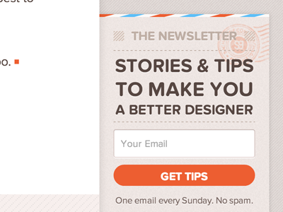

Today I'm launching a newsletter as a complement to my blog.
I thought it would be a great way to form a more personal connection with readers and discuss some things that I'd rather not discuss publicly (like, say, which sites I find the most ugly ;)
If you're curious, you can learn more and sign up here.
P.S.: Thanks to @Made By Thomas for his stamp!
P.P.S.: The first topic I'll cover is how to deal with clients who tell you to "make the logo bigger".


