Find designers
Designer search
Quickly find your next designer
Post a job
The #1 job board for design talent
Inspiration
Courses
UX Diploma
Learn UX design from scratch in 6 months
UI Certificate
12-week UI skill building for designers
Live interactive workshops
with design professionals
Jobs
Go Pro
Log in
Dribbble: the community for graphic design
Log in
Sign up
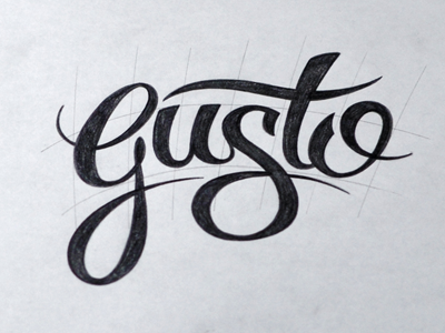
Gusto Sketch
Ryan Hamrick
Available for work
Follow
Following
Like
Get in touch
#D8DADF
#BDC0C5
#232228
#393944
#A0A0A7
#7B7B85
Download color palette
Proposed logotype for a new client. See anything crazy?
Biggun' attached.
gusto
lettering
logotype
pencil
script
sketch
type
typography
View all tags
Posted on Sep 25, 2012
3,608
33
198
37
View feedback
Ryan Hamrick
Welcome to my design portfolio on Dribbble
Get in touch
More by Ryan Hamrick
View profile
Previous
Next
Loading…
Loading…
Loading…