Endangered Panda Conservation: Daily Logo 03

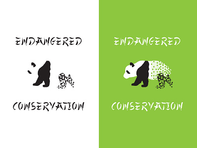
Most panda logos (like the World Wildlife Fund's or Panda Express') are very minimalist, sometimes no more than some black patches for eyes and ears. There aren't many that show a whole panda in profile, so I decided to try to do that.
Since this logo is supposed to be for a conservation nonprofit, I wanted to emphasize the "endangered" part by showing the panda mark fading away. A gradient might not have been noticable, so I chose to divide the panda into blocks and then delete some of the blocks.
For situations where it's not practical to use the panda mark, I planned a version that would simply say "Endangered Panda Conservation," with each word stacked on top of the other.
When it comes to feedback, I'd love to hear your opinion on the black-and-white version. Is the panda shape recognizable as a panda? And are the missing blocks still effective without the missing white blocks being visible?
Thanks for looking and reading!


