Find designers
Designer search
Quickly find your next designer
Post a job
The #1 job board for design talent
Inspiration
Courses
UX Diploma
Learn UX design from scratch in 6 months
UI Certificate
12-week UI skill building for designers
Live interactive workshops
with design professionals
Jobs
Go Pro
Log in
Dribbble: the community for graphic design
Log in
Sign up
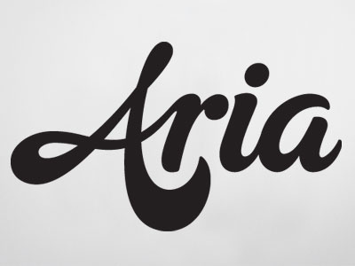
Aria
Rob Clarke
Follow
Following
Like
#E6E6E6
#232021
#C1BEBF
#A2A0A1
#5F5D5E
#413E3F
Download color palette
A rough that didn't get through : (
lettering
script
type
typography
View all tags
Posted on Sep 21, 2012
2,827
8
82
13
View feedback
Rob Clarke
More by Rob Clarke
View profile
Previous
Next
Loading…