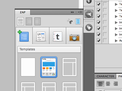
Zap Mini menu

Zap-minimenu

23 Responses

  1. Norm Norm

    Hey guys, looking for some feedback here. I've been going crazy trying to get these mini icons looking good but its been a total mission in a half.

    Do you think the snips and a guides icons (top right) look ok?

    Very tricky with so few pixels!

    Update:You can now download WebZap HERE

    likes

    9 months ago

  2. Andy Baltes Andy Baltes

    The guides one seems a little harder to make out... Perhaps try grey "content boxes" and keep the grid columns blue like you have it? That way it's not blue on blue?

    But looking nice =)

    Edit: At closer look perhaps it is grey? But the blue columns are playing tricks on me, so maybe a different shade of grey so it stands out more instead of blends?

    9 months ago

  3. Norm Norm

    @Andy Baltes I tried that, it really clashed.

    9 months ago

  4. Andy Baltes Andy Baltes

    @Norm Yeah, I wasn't sure how it would look just an idea. So moving on... have you tried removed the "content boxes" and just having a columns? Or does that look not descriptive enough?

    9 months ago

  5. Joao Pires Joao Pires

    Perhaps less columns on that little one? :)

    9 months ago

  6. Joe Barber Joe Barber

    Yeah, maybe try fewer columns?

    likes

    9 months ago

  7. Andrey Maxim Andrey Maxim

    wow wow wow

    9 months ago

  8. Justin W. Siddons Justin W. Siddons

    If it's a guide icon maybe it should just be guides and no visible boxes. Your icon work looks great but perhaps that particular one doesn't need as much detail. Very attractive work so far :)

    likes

    9 months ago

  9. Sergio Camalich Sergio Camalich

    I'm on the fewer columns team, too.

    9 months ago

  10. Norm Norm

    So less columns. I tried 1px columns but they make you go cross eyed, at least they did to me. Maybe I'll nudge it down to 3 columns.

    9 months ago

  11. Bryan Kearney Bryan Kearney

    Would going monochromatic like the layout icons on the left help? Why such high fidelity there? IDK maybe simple is better in this case.

    likes

    9 months ago

  12. Oleg Melnychuk Oleg Melnychuk

    Camera icon feels too short, comparing to the rest on that row… The plus sign makes the first icon slightly out of balance, in my opinion, but that's nitpicking :)

    9 months ago

  13. Vince Gonzalez Vince Gonzalez

    What if you got rid of the grey boxes in the guides? I think it's pretty standard to see just guides on a blank document when starting off.

    likes

    9 months ago

  14. Michael Sigler Michael Sigler

    The scissors look fine. For the guides, you might try a bit of pink instead. Something along these lines. http://d.pr/i/zzz3

    likes

    9 months ago

  15. Norm Norm

    Thanks for all the feedback guys, really appreciate it!

    @Michael Sigler that looks pretty decent

    9 months ago

  16. Diego Monzon Diego Monzon

    You are killing me here !!! I want it :-)

    likes

    9 months ago

  17. Michael Sigler Michael Sigler

    @Norm Glad it helped. :)

    9 months ago

  18. Silviu Stefu Silviu Stefu

    I would make them in one single color... and fewer columns... I can't wait to see it in action...

    9 months ago

  19. Martin Velchevski Martin Velchevski

    As far as the 'guides' icon is concerned I think it would help a lot if you use that signature #4affff Adobe default guide color instead of the blue you used. It would overall add for a quicker and better read of the icon. That may clash your color scheme a bit though... Worth a try IMO. Anyways... I'm excited! Good job!

    likes

    9 months ago

  20. Norm Norm

    @Oleg Melnychuk I've removed the plus from the first icon, it actually made more sense to remove it. looks much better now!

    9 months ago

  21. Riki Tanone Riki Tanone

    I looked at the shot before reading the description, and everything made sense to me.

    What's the rocket icon (underneath the Zap icon)? It looks really familiar.........

    9 months ago

  22. 9 months ago

  23. Norm Norm

    @Riki Tanone its the icon for DevRocket another one of my ps plugins.

    9 months ago

keyboard shortcuts: previous shot next shot L or F like