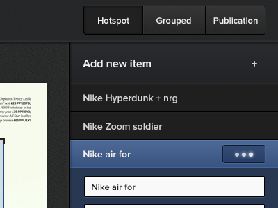
Sidebar tabs

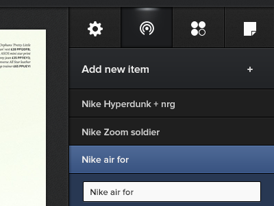
This time we added the tabs inside the list with icons only. It gives a much more unified feeling. Besides that, the "Saving" status can now be moved inside the header. Less clutter while editing your items inside the list. The icons are temporary btw. Haven't decided what to do with them yet.