Find designers
Designer search
Quickly find your next designer
Post a job
The #1 job board for design talent
Inspiration
Courses
UX Diploma
Learn UX design from scratch in 6 months
UI Certificate
12-week UI skill building for designers
Live interactive workshops
with design professionals
Jobs
Go Pro
Log in
Dribbble: the community for graphic design
Advance your career with a Professional Diploma in UX Design
Learn more
Log in
Sign up
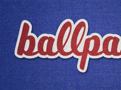
Ballpark Typeface
Rob Wootten
Follow
Following
Like
#374893
#19266D
#4D5DA6
#A5393F
#D9D6D7
#641C2B
#7E85BE
Download color palette
Baseball inspired typeface design.
baseball
blue
bright
font
logo
red
script
texture
type
typography
uniform
View all tags
Posted on Nov 2, 2010
3,612
2
67
16
View feedback
Rob Wootten
More by Rob Wootten
View profile
Previous
Next
Loading…