Find designers
Designer search
Quickly find your next designer
Post a job
The #1 job board for design talent
Inspiration
Courses
UX Diploma
Learn UX design from scratch in 6 months
UI Certificate
12-week UI skill building for designers
Live interactive workshops
with design professionals
Jobs
Go Pro
Log in
Dribbble: the community for graphic design
Log in
Sign up
Swap
Bady
Available for work
Follow
Following
Like
Get in touch
#F4F2EF
#A1A1A3
#1F1F26
#C8BCB3
#595D64
#B3976C
#7296C1
Download color palette
Swipe state
Bigger pixel
---
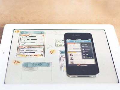
More about this project
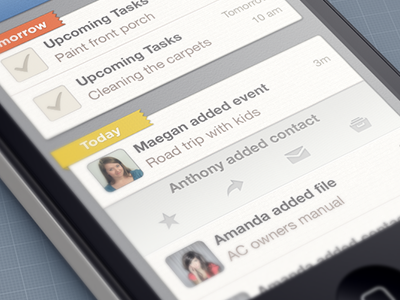
Rebound of
Sketch & Mockup
By
Bady
activity
app
archive
categories
category
check mark
clean
clear
contact
event
favorite
gui
header
home
ios
iphone
list
management
message
modern
navigation
reply
star
swap
task
tasks
to do
ui
ux
visual
View all tags
Posted on Sep 15, 2012
46,786
112
444
15
View feedback
Bady
Get in touch
More by Bady
View profile
Previous
Next
Loading…
Loading…
Loading…