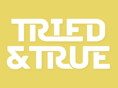
T&T Mark

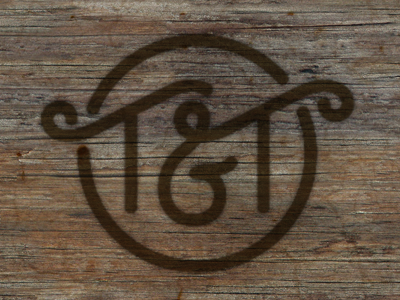

So this is for a retail shop located on a farm. The client suggested a cattle brand look for the logo which I think is a great fit for them. This is just the alt mark. Full logotype will follow. ..
I do still have a few details to touch up. Some curves aren't perfect yet and I'd really like to get the negative space between the T's more even...
What do you prefer though, with or without the enclosing circle / loops on the T's?