Food Therapy

Good call, great suggestion!
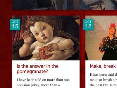
I also added a *very* subtle background gradient on the date label as well, so it doesn't feel quite so flat. Hopefully I'll be able to add a few more shots of this as I make progress.
I welcome all feedback, thank you!


