Xapo card - transactions listing

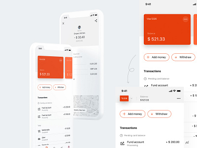

Throwback from last year when I worked on screens for the Xapo pre-paid card.
A nifty trick we've done is to collapse the card header when users scroll down to see their transactions. Because some users might have multiple cards, when digging for a transaction, it helps to have a summary of the most important info about that card, as well as a quick way to select another card, without scrolling back to top. It decreases the load on the users' memory at a time of confusion (people typically don't search for their transactions unless there's a problem) and increases the ease of use by providing a shortcut.


