There's good stuff going on here. The search bar is a little busy and I'm not sure I love the flatness (and lack of button borders) in the UI, but there's definitely good stuff in there.
You're welcome, man! I'm a big fan of button borders because they make it very clear to the (average) user that a button is a button. Also, since iOS has so much pseudomorphism throughout and third-party iOS apps, real-looking buttons (with borders) feel better and give the user a better sense of actual buttons. Buttons without borders feel more like links than buttons.
What are your thoughts on button borders vs. no button borders?
@Luke Bornheimer With this design I was looking to push the boundaries a little, do something different, get away from the typical iOS look and feel. I also wanted to see what would happen if I totally stripped down the UI, took it all the way back to pure functionality. Lately I've been doing a bit of thinking about design history etc. and I'm trying out a few different things. Whether or not it works, well, we'll find out ;)
Really nice dude, however I agree with @Victor Erixon that some of the buttons are a little too close to each other. Also just a question - How does the red 'x' button appear. Should there be an edit button somewhere, and then all friends would have a 'x' next to them?
37 Responses (page 1 of 2)
Pro
Nathan Walker
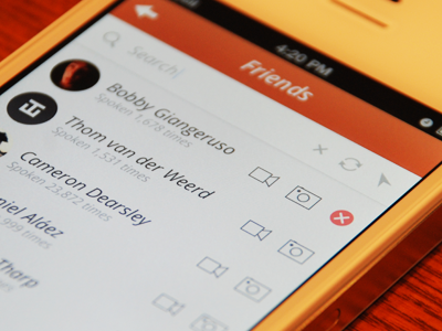
Had a little free time so I developed an old something. Liked @Coleman's shot so I rebounded it. Just went Pro so the real pixels are attached.
Yo @Bobby!
8 months ago
Pro
Robert McMann | Braeson
Fantastic shot, Nathan. And, FYI... You were Pro long before this. ;)
8 months ago
Pro
Ivan Kutcher
@Nathan Walker Perfect work ;)
8 months ago
Pro
Coleman Tharp
Dope, rad and I love it!
8 months ago
Pro
Haziq Mir
No italics at the top please. I love everything else!
Also, did you take this photo yourself?
8 months ago
Pro
Nathan Walker
@Haziq Mir Everyone loves italics! Lol jk thanks. Yeah, the camera was having a good day today :)
8 months ago
Pro
Luke Bornheimer
There's good stuff going on here. The search bar is a little busy and I'm not sure I love the flatness (and lack of button borders) in the UI, but there's definitely good stuff in there.
8 months ago
Pro
Alex Parker ⇢ ☁
Hello sweet font
8 months ago
Pro
Nathan Walker
@Luke Bornheimer thanks for the feedback man! Just a question, why do you like button borders?
8 months ago
Pro
Luke Bornheimer
You're welcome, man! I'm a big fan of button borders because they make it very clear to the (average) user that a button is a button. Also, since iOS has so much pseudomorphism throughout and third-party iOS apps, real-looking buttons (with borders) feel better and give the user a better sense of actual buttons. Buttons without borders feel more like links than buttons.
What are your thoughts on button borders vs. no button borders?
8 months ago
Pro
Max Klimchuk
man! super work
8 months ago
Pro
Nathan Walker
@Luke Bornheimer With this design I was looking to push the boundaries a little, do something different, get away from the typical iOS look and feel. I also wanted to see what would happen if I totally stripped down the UI, took it all the way back to pure functionality. Lately I've been doing a bit of thinking about design history etc. and I'm trying out a few different things. Whether or not it works, well, we'll find out ;)
8 months ago
Pro
Victor Erixon
Really nice! Though isn't some of the items too close to each other to be clickable?
8 months ago
Pro
Mark Law
Really nice dude, however I agree with @Victor Erixon that some of the buttons are a little too close to each other. Also just a question - How does the red 'x' button appear. Should there be an edit button somewhere, and then all friends would have a 'x' next to them?
8 months ago
Pro
Nathan Walker
@Mark Law Thanks man. Yeah the buttons may be a little close. X appears on swipe.
8 months ago
Pro
Dhiren Adesara
nice !
8 months ago
Pro
Thom
It's me!! haha, great work man. ;D
8 months ago
Pro
Luboš Volkov
like it!
8 months ago
Pro
Bobby Giangeruso
Haha, wow! Awesome work man. :)
8 months ago
Pro
Andrey Maxim
You forgot to mention @Haziq Mir, thats why he said about italic))
Very cool!
8 months ago
Pro
Tanveer Junayed
woah man! You totally nailed it.
8 months ago
Pro
Tobias Negele
What font did you use?
8 months ago
Pro
Nathan Walker
@Toby Negele Open Sans
8 months ago
Pro
Dmitriy Chuta
Nice!
8 months ago
Pro
Denis Talalá
Nice icons.
8 months ago