Swifty2

1 Attachment

26 Responses (page 1 of 2)

  1. Pro Julia Khusainova Julia Khusainova

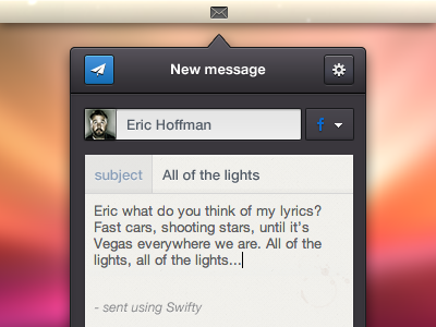
    Client wanted to try the dark version. I think I like the way it turned out.

    Full view. Feedback is welcome.

    Thanks, people of Dribbble. And Happy Friday!

    *** @julia

    9 months ago

  2. Pro Claudio Gomboli Claudio Gomboli

    Really nice. I think this version is better, for colors and contrast. And happy friday! ;)

    likes

    9 months ago

  3. Andrey Geranin Andrey Geranin

    Dark one 10 times better. Or 15 times. Well, it is cool.

    likes

    9 months ago

  4. Pro Bady Bady

    Looks nice Julia :) personally I don't really like the coffee mark there, I think it's Ok to be removed. I also suggest to make the subject and the title bold. Btw what's the fb DD button function? it will be sent to fb message?

    I think make the button wider a bit won't hurt and can make more easier to click hehe

    rest is better :)

    likes

    9 months ago

  5. Pro Ionut Zamfir Ionut Zamfir

    Looks great, @Julia Khusainova

    likes

    9 months ago

  6. Kateryna Logvynenko Kateryna Logvynenko

    Wow! This version looks really better)

    likes

    9 months ago

  7. Adi Pintilie Adi Pintilie

    Awesome!

    likes

    9 months ago

  8. Pro Jonathan Moreira Jonathan Moreira

    I also prefer this version. Looks good @Julia!

    likes

    9 months ago

  9. Cristhian Serur Cristhian Serur

    Excellent work!

    likes

    9 months ago

  10. Pro Julia Khusainova Julia Khusainova

    Wow guys thanks so much for your comments!

    @Claudio, @Andrey, @Kateryna, @Jonathan agree with you. Prefer this version over the light one.

    @Bady Good point on coffee mark, I think I can get rid of it to make it look cleaner. This app allows you to send messages to your contacts on FB, Twitter personal message and Gmail message. So the drop down will pull down the services available for this contact (I might have Eric as a contact on FB, Twitter and Gmail ;)

    Btw the drop down design is coming shortly!

    likes

    9 months ago

  11. Pro Luboš Volkov Luboš Volkov

    Like that contrast on the dark version nice work :)

    likes

    9 months ago

  12. Pro Kartik Mahant  Kartik Mahant 

    Hey Jul, your getting good with this stuff.

    likes

    9 months ago

  13. Pro Aleksandar Djuric Aleksandar Djuric

    Dark version. Definitely. There's no doubt about it.

    likes

    9 months ago

  14. Pro Jack Bingham Jack Bingham

    Yeah, I prefer this version. What about making the Facebook logo white? It's difficult to see over the black.

    likes

    9 months ago

  15. Pro Juan Arreguin Juan Arreguin

    @Julia Khusainova I agree with all the comments above. An to add to that I think that I would change the color of Facebook's icon to white, instead of blue. Just it feels weird having a color on that button in my opinion, make the button wider, give it more physical footprint, and Take out the coffee stain, and you're golden! Great stuff.

    likes

    9 months ago

  16. Pro Jack Bingham Jack Bingham

    @Juan Arreguin Dude. Copying or what. I'm gonna call you out on Twitter.

    likes

    9 months ago

  17. Pro Samuel Kraft Samuel Kraft

    This one's better! A lot nicer on the eye. Great work @Julia Khusainova

    likes

    9 months ago

  18. Pro Liam McKay Liam McKay

    This looks beautiful, is this going to be made into a real app? Would love something like that.

    likes

    9 months ago

  19. Pro Julia Khusainova Julia Khusainova

    @Jack, @Juan I think you guys have a point. I just wanted to use the branding FB color (or Twitter if it is displayed).

    @Liam Exactly :)

    9 months ago

  20. Pro Juan Arreguin Juan Arreguin

    It just doesn't go well with the UI and the dark interface to have another "accent" color. Your main action, and what you want the user to do is "send" the message.

    UX-wise, I'd even switch the options gear and the send button, just because you want the user to go from selecting an user, to typing a message, to sending... all actions that suggest a -> forward action... and having the button on the left, you're making the user go "backwards" in that flow.

    And again back to the color, the blue accent color should be the send button, when you bring another color in, such as in the Facebook, it distracts the flow you've set for the user.

    (sorry for the long message) :P

    likes

    9 months ago

  21. Pro Enzo Li Volti Enzo Li Volti

    Dark is better! cool

    likes

    9 months ago

  22. Pro Julia Khusainova Julia Khusainova

    Now that I look at it from that angle I agree that having 2 blue color in 2 different places is probably confusing.

    For the Send and the Settings buttons - I tried to follow the OSX flow - people are used to native email client where we have Send button on the left (I agree, it feels a bit awkward but users are used to it). It just makes sense to me to get these action buttons where normally are so that user doesn't have to think twice to send the message.

    Well what can I say - constructive feedback is beautiful. Thank you, @Juan! :)

    likes

    9 months ago

  23. Pro Damian Hernandez Damian Hernandez

    This version it's even more awesome.

    likes

    9 months ago

  24. Pro Sara Menefee Sara Menefee

    Beautifully done. I really like the dark version. However, the Facebook icon should be white or a lighter colour. It strains my eyes a bit to look at it.

    That or some kind of contrast between the background colour and the button used. :)

    Love what you have going here!

    likes

    9 months ago

  25. Pro Sinziana Ene Sinziana Ene

    Great work!

    likes

    9 months ago

keyboard shortcuts: previous shot next shot L or F like