Goodreads' homepage redesign

Here’s my concept of Goodreads’ homepage redesign. I’ve made it as a part of contest.
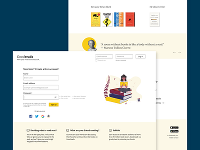
First of all, I made some improvements in registration forms. I wanted to make whole homepage simpler and more eye pleasant.
I found information that brown is (statistically) the most hated color by both women and men, so I changed color scheme. I also chose serif font associated with books.
Last but not least, I added some visuals. I hope you like it!


