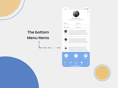
Bottom Navigation

Hello!!,
This the final one in the series of HRMS attendance flow.
When i first got the hand on the existing application of my client. I found that their menu navigation, including labels of menu items were very confusion. Since this application enabled both employee and manager to do their day to day activities. It was quite difficult to understand what menu items meant.
So i coordinated with them and along with help of technique called "Card sorting", prioritized, structured and brought the menu into clean and minimal shape. So that only relevant information is displayed at the top level and gradually the related items were sub-grouped.
Appreciate your feedback.
Show some love :)


