


PIRS chart

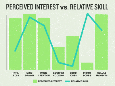
So, I stumbled upon my friend, Dave Rupert's About page, and loved his chart titled "perceived interest vs. relative skill". It made me laugh, so in his honor, I created one for myself.
If you dig this, make one for yourself and rebound this shot! Oh, and also show Dave some love for his original too.


