Livingphit Physical Fitness Logo Design

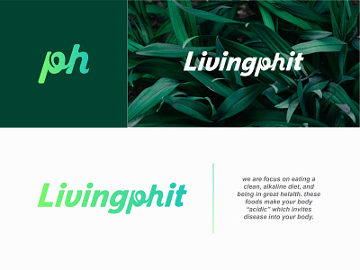
As you can see we are emphasizing the pH in “phit”. This is because our focus is on eating a clean, alkaline diet, and being in great health. This “pH” comes from the pH scale. Some of you may know eating alkaline involves staying away from:
Sugar, Wheat, Soda & alcohol, Most fast food.
These foods make your body “acidic” which invites disease into your body. So in our first logo, we wanted to show some of the colors from a pH scale, which looks like this:
You’ll see the pH in the current logo is featured. That’s because pH has to do with alkalization of the body. (This refers to the pH scale) The idea of living PHIT (pronounced “fit”) is that people are living concious of the importance of alkalizing the body. Please do something creative with the pH again, but we’re not sure what. I know the current huge box around the pH is way too much, way too obnoxious.
Let me know what do you think about this? Any feedback is welcome!
Other Portfolio Links


