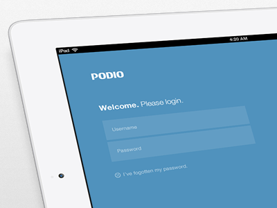
Podio for iPad, now.

30 Responses (page 1 of 2)

  1. Pete Lacey Pete Lacey

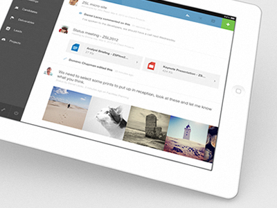
    So, after many many many months of hard work I can proudly announce that we've (finally) released Podio for iPad.

    It's a been a long but exciting journey trying to distill Podio's complexities for iPad, and I can honestly say I've learned something new with every twist and turn. This first version of the app is very much a companion to the web version, but over time it will evolve into an app that can stand on it's own.

    Now my little baby is taking its first step out there in the world for everyone to see, which is equally terrifying as it is exciting. I can't wait to see what the future holds for this guy.

    A massive round of applause has to be given for Podio's iOS developer, Sebastian, who had to listen to my crazy ideas and random hand movements used to describe animations, yet still manage to construct a blisteringly fast iPad app.

    Head over to the App Store on your iPad to grab it.

    ---

    Re: Where I stand on tilty iPad shots on Dribbble.

    I don't give a crap. The main reason *I* use them is because when you experience a design on a device you don't see that design in pixels, you see it as part of the world. The device's "being" is part of the design, and therefore it makes sense (to me) to show this context in the shot rather than a random patch of pixels which is never the way you'd experience the product unless you're some kind of robot. Some people like it, some people don't. I honestly take it on a case by case basis. Don't be a hater just because the effect is used a lot. Peace.

    likes

    10 months ago

  2. Haziq Mir Haziq Mir

    TL;DR.

    Seriously though, no one tilts his device while using it.

    Great work. I am a sucker for this style.

    likes

    10 months ago

  3. Joris Rigerl Joris Rigerl

    Good job. Missing the chicken plug though.

    10 months ago

  4. Dennis Flinsenberg Dennis Flinsenberg

    This sucks, do it again.

    10 months ago

  5. Mikkel Aggerbo Mikkel Aggerbo

    I love it, downloaded and running! The team is impressed.!

    likes

    10 months ago

  6. Daniel Keller Daniel Keller

    looks great!
    I have nothing against this, and I think not many have either!
    even if you photograph it on your ipad or iphone, it makes sense to me.
    but to me it doesn't make sense on a regular desktop display or notebook.

    10 months ago

  7. Paul Galbraith Paul Galbraith

    Looks beautiful, good job!

    10 months ago

  8. Casper Klenz-Kitenge Casper Klenz-Kitenge

    Looks amazing man, big congrats on shipping!

    Re: tilty iPad shot

    10 months ago

  9. Yassine Bentaieb Yassine Bentaieb

    You've done a great job on this man, looks clean, usable and beautiful.

    10 months ago

  10. Flemming Rasmussen Flemming Rasmussen

    Very clean and beautiful Pete!

    10 months ago

  11. Jon Gold Jon Gold

    lovely textures, A++

    likes

    10 months ago

  12. Justin Roberts Justin Roberts

    Very nice indeed @Pete

    10 months ago

  13. Joachim Löfstedt Joachim Löfstedt

    Looks great Pete, well done!

    10 months ago

  14. Waseem Arshad Waseem Arshad

    great job @Pete Lacey

    10 months ago

  15. Luke Beard Luke Beard

    hero

    10 months ago

  16. Andrey S. Rodrigues ☝ Andrey S. Rodrigues ☝

    great work man!

    10 months ago

  17. João Oliveira Simões João Oliveira Simões

    Just great! Thank you for finally give us the App for Podio :D

    10 months ago

  18. Ismael Burciaga Ismael Burciaga

    This is nice.

    10 months ago

  19. Jason Wu Jason Wu

    Good job. Simplicity is king!

    10 months ago

  20. Tyler Allen (ModernBits) Tyler Allen (ModernBits)

    I'll say this. When I was running a web hosting company I had a lot of management issues and when I came around Podio I did not use it cause of the UI. Now it looks AMAZING!

    It's a beautiful design, but it does give me the metro feel. Not a bad thing at all though. Great work dude! :)

    10 months ago

  21. Andrew Hart Andrew Hart

    I really like the style of it. Definitely has it's own unique look.

    10 months ago

  22. Eduardo Santos Eduardo Santos

    The only thing I don't like is the blue on the top right next to the green, I would try black or a dark grey.

    Great work btw!

    10 months ago

  23. Philip Clark Philip Clark

    I agree with your reasoning re: iPad shots. It would be great to see this a bit bigger!

    10 months ago

  24. Steffen Nørgaard Andersen Steffen Nørgaard Andersen

    Great work @Pete (and the rest of you guys) - I have just two comments:

    1: On the contacts list. If you enter the search-field (making the keypad appear) and then select a person from the list (showing the profile on the right), the keypad does not slide back down, hiding some of the contact-persons info.

    2: Have you considered making it posible to slide between workspaces? Working a bit like the "pull down to refresh"-function this could work both up and down, between workspaces. A bit like the Clear app actually.

    Other than that, GREAT work!

    10 months ago

  25. Alexander J. O'Connell Alexander J. O'Connell

    Download the app to see for yourself.

    Love the flat, clutter-free style. Transitions are masterful.

    This & Svpply are easily among the best designed & built iPad apps out there, for me.

    likes

    10 months ago

keyboard shortcuts: previous shot next shot L or F like