Find designers
Designer search
Quickly find your next designer
Post a job
The #1 job board for design talent
Inspiration
Courses
UX Diploma
Learn UX design from scratch in 6 months
UI Certificate
12-week UI skill building for designers
Live interactive workshops
with design professionals
Jobs
Go Pro
Log in
Dribbble: the community for graphic design
Log in
Sign up
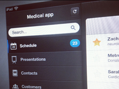
iPad medical app
Max Litvin
Available for work
Follow
Following
Like
Get in touch
#514E5C
#35242A
#EEF0F1
#69718A
#ABACB5
#5B9CC0
Download color palette
What do you think?
app
customers
dark
dashboard
doctor
ipad
medical
mobile
retina
schedule
ui
ux
View all tags
Posted on Sep 5, 2012
8,999
30
139
9
View feedback
Max Litvin
Get in touch
More by Max Litvin
View profile
Previous
Next
Loading…
Loading…
Loading…