Mail app

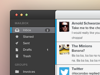

So, yeah, a mail app concept. The funny thing is, I was fiddling with this and came up with this mail app. Life is full of surprises...
So, yeah, a mail app concept. The funny thing is, I was fiddling with this and came up with this mail app. Life is full of surprises...


