Find designers
Designer search
Quickly find your next designer
Post a job
The #1 job board for design talent
Inspiration
Courses
UX Diploma
Learn UX design from scratch in 6 months
UI Certificate
12-week UI skill building for designers
Live interactive workshops
with design professionals
Jobs
Go Pro
Log in
Dribbble: the community for graphic design
Advance your career with a Professional Diploma in UX Design
Learn more
Log in
Sign up
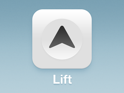
Lift App Icon
Pacific Helm
Available for work
Follow
Following
Like
Get in touch
#AFCAD5
#E8E8E9
#7CA2B5
#97B8C7
#515151
Download color palette
Achieve any goal and track your progress with Lift.app:
http://lift.do
app
arrow
button
circle
clean
elevator
icon
ios
iphone
lift
triangle
white
View all tags
Posted on Aug 30, 2012
8,043
20
132
6
View feedback
Pacific Helm
Get in touch
More by Pacific Helm
View profile
Previous
Next
Loading…
Loading…
Loading…