@Paul Ungureanu O totally, me too. Thanks for the feedback. Make you focus on the important stuff, it's hard though, as things that work badly can't be hidden behind fluff.
Finished up this project last year and here is some of the screens of the Admin of the app. Also what I use to keep colour use consistent through-out the design.
15 Responses
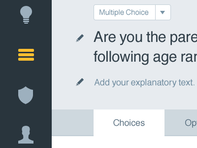
This is the beginnings of the Admin to the Admin section for the App. I'm kinda picky about using colours consistently :) - see attachment
9 months ago
Pro
Danny Zevallos
Super clean and welcoming! Great work!
9 months ago
Pro
Matt Crummy
Nice! Also, your attachment reminds me of http://0to255.com/ :)
9 months ago
@Matt Crummy Looks like a great tool. I use http://colllor.com/
9 months ago
Pro
Paul Ungureanu
As of late I'm starting to "fall" for these types of flat (honest, to the point) layout design. Good job!
9 months ago
@Paul Ungureanu O totally, me too. Thanks for the feedback. Make you focus on the important stuff, it's hard though, as things that work badly can't be hidden behind fluff.
9 months ago
Pro
Ted Goas
Where's the option to Like an attachment?!
9 months ago
Pro
Eduardo Santos
You're killing me. :)
9 months ago
Pro
Paul Ungureanu
@Regina Casaleggio I totally agree :)
9 months ago
Pro
Kesley Bassini
Looks Great Regina.
9 months ago
Pro
Daniel Klopper
@Regina Casaleggio Looking great! @Ted Goas you are special man. :)
9 months ago
Pro
Krystyn Heide
Lovely work, lady!
9 months ago
Pro
Nuruzzaman Sheikh
amazing colors! love the cleaned interface so much!
9 months ago
Rebound
App Admin
by Regina Casaleggio
Finished up this project last year and here is some of the screens of the Admin of the app. Also what I use to keep colour use consistent through-out the design.
4 months ago
Pro
Konrad Księżopolski
Good job, I like your style ;)
2 months ago