Find designers
Designer search
Quickly find your next designer
Post a job
The #1 job board for design talent
Inspiration
Courses
UX Diploma
Learn UX design from scratch in 6 months
UI Certificate
12-week UI skill building for designers
Live interactive workshops
with design professionals
Jobs
Go Pro
Log in
Dribbble: the community for graphic design
Log in
Sign up
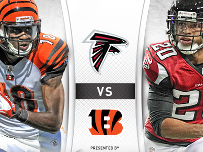
Gameday Matchup Graphics
Matt Lange
Follow
Following
Like
#EFF0F0
#1E1D1C
#5D5A57
#ACABAD
#C44D3A
#757F91
#BC8D6C
#59342D
Download color palette
altanta
bengals
cincinnati
falcons
football
nfl
View all tags
Posted on Aug 29, 2012
1,802
4
25
8
View feedback
Matt Lange
More by Matt Lange
View profile
Previous
Next
Loading…