Sindro - Brand Guidelines


Recently I was working on the new brand for Sindro - A studio and member management platform that aims to dominate the US health and lifestyle market before Q4 2020.
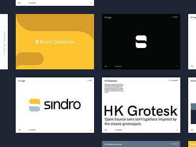
Sindro was designed with the emphasis on providing studio owners a peace of mind. That being said, the "S" is partially inspired by the yin and yang symbol. To give more context "Sind" translates to mind and "ro" translates to calmness in Danish.
In addition to being the CEO of Sindro, our client, Allen owns and manages multiple gym studios. His past experiences using archaic products lead him to conceptualize a product that delivers a profound peace of mind experience.
The branding that I've created consists of three main elements:
Logo, Color palette and Patterns/textures.
More Dribbble shots and case study coming soon. Stay tuned.


