Brand Process: Logo Development


There is a bunch of ways to begin the process of actual logo design and I subscribe to many of them. Many factors play a role in the process of how I go about developing a logo. Turn around time, level of customization (ie custom script or type), and style considerations all affect where and how I start.
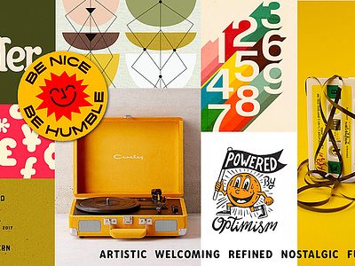
1. That Brand's got personality. Understand the brand's personality will help define the look and approach the aesthetic. For example, if you are creating a logo for the Texas Oceanliner Surf Squad you begin to picture rustic, industrial and perhaps cowboyesque elements that have a specific look that you can draw from.
2. Time to get inspired. Once you have a lockdown on the personality then get inspired. Dig around the internet, check out Pinterest, regional context, vintage photos, art movements that you're inspired by, whatever floats your yacht.
3. Sketching feels like comedy sometimes. Isketch in sharpie and on post-its, I move quickly and refine what seems to be a good concept by putting the post-its over each other tracing something that looks good to do small changes. I dig post-its because they are small, like an icon, and after I do a bunch of them I put them up on the wall and see which one sticks. See what I did there.
4.The Refined way of life. Select some concepts to refine and further develop digitally in illustrator, or whatever you use to make digital magic happen.
No, you're an Iterate. Make small changes in width, height, thickness, dimentionality, etc.) This process can seem chaotic but remember as Aaron Draplin once said, "Vectors are free". Copy and paste will be your best friend or option/alt, click and drag. Sometimes you just have to see what it would look like with rounded corners. Really explore the max capacity of the artboards range.
5. America's next top 2 or 3 logos. Select the top two or three out of the pack and apply a color treatment. Try a mixed bag here. Tone on tone, high contrast, black and white, using the brand personality a metric of calibration of sorts. If a brand is bold like Nike then there should be high contrast in the color palette, if the brand is more natural like Meyer's Cleaning Products then the color should reflect those values.
6. More is... More. Tertiary elements can go a long way when you are developing a brand. Exploring graphics that can enhance the primary logo and support it will strengthen its prowess. You can accomplish this by creating monograms, crests, seals, elements that perhaps have regional context (made in...) Make sense?
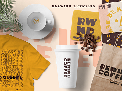
7. Best in Show. This is where I begin to show the brand in the context of its product. If I am developing a coffee brand, I'll put it on a coffee cup, mug, take a stab at a loose bag design, shirt, etc. The goal here is to give the appearance that the brand is alive and real.
Let me know what you think of my process.
Is this helpful? What's your process like? How can I help?
Read my full write up on my MEDIUM page.