Settings IOS

2-shot

19 Responses

  1. Jérémy Stenuit Jérémy Stenuit

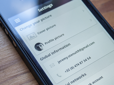
    This is the settings view for a mobile application I'm working on.

    First time I did this, feedback are welcome !

    likes

    10 months ago

  2. Alexandre Naud Alexandre Naud

    Looks good. ;D

    likes

    10 months ago

  3. Bastien Wilmotte Bastien Wilmotte

    T'as déjà tout compris du shot populaire. :D

    likes

    10 months ago

  4. Thomas Rawcliffe Thomas Rawcliffe

    I'd tap that.

    likes

    10 months ago

  5. Nuruzzaman Sheikh Nuruzzaman Sheikh

    nice and clean!

    likes

    10 months ago

  6. Abdessamad - Afnane studio Abdessamad - Afnane studio

    Très propre !

    likes

    10 months ago

  7. Nikh Nikh

    The section headers could be 1-2pt smaller IMO.
    From the screenshot, it looks like the section headers have equal top and bottom padding. Decrease the bottom padding by a few pixels and add those to the top. This way, the section headers will pertain more association with the section content.

    likes

    10 months ago

  8. Jérémy Stenuit Jérémy Stenuit

    @Nikh In fact the bottom padding is smaller than the top padding but I'll increase it by a few pixels, thanks for your feedback !

    likes

    10 months ago

  9. Finn Finn

    I would totally get that app!
    Nice and clean design.
    What app is this for?

    likes

    10 months ago

  10. Jérémy Stenuit Jérémy Stenuit

    @Finn Thanks ! It's an app for merchants so they can manage their business, you'll see more screens soon :)

    10 months ago

  11. Karim Maaloul Karim Maaloul

    chouette entrée dans dribbble :)

    likes

    10 months ago

  12. Boris Borisov Boris Borisov

    Great job !! :)
    What's the font that you're using?

    10 months ago

  13. Jérémy Stenuit Jérémy Stenuit

    @Boris Borisov The font is Open Sans :-)

    10 months ago

  14. Boris Borisov Boris Borisov

    @Jérémy Stenuit

    thanks (:

    likes

    10 months ago

  15. Luboš Volkov Luboš Volkov

    looks clean, keep going! :)

    likes

    10 months ago

  16. Phantasy Phantasy

    clean & clear~

    maybe there is a better representation of the picture section(a litte bit like ios wallpaper setting?), because the real content is the icon(change picture), not the text area. this makes your setting list visually united, but actually not like that...

    10 months ago

  17. Maria Shanina Maria Shanina

    wow! will it be completely monochrome?

    10 months ago

  18. Jérémy Stenuit Jérémy Stenuit

    @Maria No. That's just the settings view. We have some colors for the others views :-)

    likes

    10 months ago

  19. Sultan Tarimo Sultan Tarimo

    Looks good from here, but I think you'd get better feedback if you attach the real-pixels.

    likes

    10 months ago

keyboard shortcuts: previous shot next shot L or F like