Book cover design.

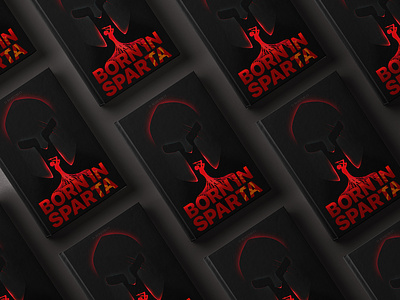


The idea of creating a cover was born from the name of the book. I wanted to show the pressure of society on a person and his inability to resist it. I also wanted to show the connection and the basis of all this in the form of the Soviet regime, which had been distorting the consciousness of people for seventy years.
Like the Spartans dropping children with deviations from the cliff, the society of the Soviet Union did not accept people who were not like them.
From this comes the name of the book and the same served as the idea of using a helmet as a symbol of a tough and devoid of compassion society.
It is based on letters with Soviet symbols applied to them.
A man is inextricably linked to letters trying to hide himself from the society that is pressing him. But he cannot escape or take refuge; the roots hold him tight.
Back and front cover. At the back, I decided to use a minimum of space and give more room for filling black, the inscription is placed vertically in a muted gradient.


