Find designers
Designer search
Quickly find your next designer
Post a job
The #1 job board for design talent
Inspiration
Courses
UX Diploma
Learn UX design from scratch in 6 months
UI Certificate
12-week UI skill building for designers
Live interactive workshops
with design professionals
Jobs
Go Pro
Log in
Dribbble: the community for graphic design
Log in
Sign up
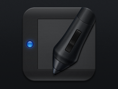
Wacom iOS Icon
coconut
Follow
Following
Like
#1E1F22
#3F4042
#2150A8
#8DA3C7
#206DC7
Download color palette
icon
intuos
ios
wacom
View all tags
Posted on Aug 24, 2012
4,456
15
249
29
View feedback
coconut
More by coconut
View profile
Previous
Next
Loading…