Navy & Yellow UI

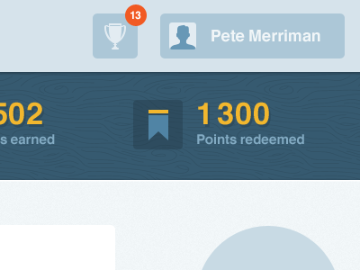
First day of introducing colour and texture to UI I'm working on. Icons are placeholder ones. Wood pattern courtesy of @Ryan Putnam - purchased at vectormill.com. Why re-invent the wheel when it's already done so beautifully :)
First day of introducing colour and texture to UI I'm working on. Icons are placeholder ones. Wood pattern courtesy of @Ryan Putnam - purchased at vectormill.com. Why re-invent the wheel when it's already done so beautifully :)


