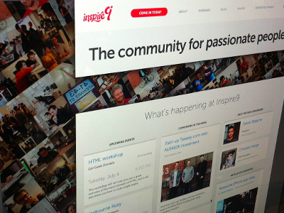
Inspire9 Coworking- 2nd round

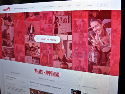

We sliced and built the last design, to find that most of the people we showed found the background distracting. That feedback led to this version. We lost the tilt on the photo mosaic, kept it in accord with the document grid, pulled it out of the background and into the flow and used more of the 'chapstick' red.
Let me know what you all think. I'm keen to hear feedback.