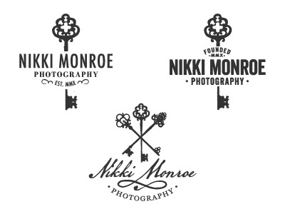
More logo mockups for Miss Nikki. She wanted something dainty and feminine but with a touch of masculinity.